

Walk into any busy neighbourhood supermarket in Kerala or Tamil Nadu and you can feel the difference between a store that was planned and a store that just grew. Shelves look full, but customers still miss half the assortment, the bakery aisle is empty by noon, and the billing queue snakes past the cold drinks that nobody picks. Better supermarket layout ideas fix that — not with fancy décor, but with a floor plan that quietly nudges shoppers to see more categories, spend a little longer, and leave with a fuller basket.
This guide is for owners and managers of Indian supermarkets, mini-marts and large kiranas who want a practical layout playbook: grid versus racetrack, power aisles, impulse zones near checkout, planogram basics, and how to measure results with category sales reports from your billing software. No design-school jargon. Just decisions you can test next Sunday when the store is closed for half a day.
Why supermarket layout ideas matter more than another discount poster
Most Indian supermarket owners invest first in stock, then in staff, then in a second billing counter. Layout comes last — usually after a customer complains that “the rice is hard to find”. That order is backwards. A clear layout:
- Raises the chance that a shopper walks past high-margin categories (personal care, snacks, ready-to-cook) instead of only staples.
- Cuts the time staff spend answering “where is…” questions.
- Makes FEFO/FIFO rotation easier because expiry-sensitive goods sit in predictable zones.
- Shortens perceived waiting time when the queue path itself shows something worth picking.
Layout does not replace good buying or clean billing. It multiplies both. If your counters already run on solid supermarket billing software, the next lever is how people move through the floor.
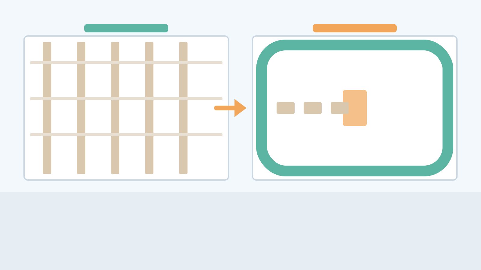
Grid vs racetrack: pick the skeleton that fits your floor
Two skeletons dominate retail floors worldwide, and both work in India when sized correctly.
Grid layout
Parallel aisles, like a library. Shoppers enter, choose a lane, and move efficiently to a known item. Ideal when:
- Your store is rectangular and deeper than it is wide (typical rented shop in a commercial complex).
- Most visits are “mission” trips — rice, oil, milk, detergent — and speed matters.
- You want maximum shelf facing per square foot.
Downside: shoppers who came for atta may never see the snacks end-cap unless you force a path past it. Grid layouts need deliberate cross-aisles and end-of-aisle displays, or the basket stays narrow.
Racetrack (loop) layout
A main perimeter path circles the store, with islands or short aisles inside. Ideal when:
- You have a wider floor and want discovery (fresh produce → dairy → bakery → staples → non-food).
- You sell a mix of daily needs and impulse categories.
- You can keep the loop clear — no cartons blocking the “track”.
Downside: mission shoppers feel forced to walk farther. In a 1,500 sq ft neighbourhood store, a full racetrack can annoy regulars who only want milk. Hybrid is common: a short loop for fresh/dairy/bakery, then a grid for packaged groceries.
Illustrative example (made-up): A 2,200 sq ft store in Thrissur used a pure grid. After shifting produce and dairy onto a U-shaped path near the entrance and keeping dry grocery in a grid behind it, average lines per bill rose from 7.2 to 8.1 over six weeks — same assortment, same offers. Numbers are fictional; the pattern is what many owners report when fresh is no longer a dead corner.
Power aisles: the path every trolley should cross
A power aisle is the wide, high-traffic lane that connects entrance to the back of the store (or to the fresh zone). Treat it like a main road:
- Keep it 1.5–2 trolley widths clear. No broken cartons, no “temporary” promo dump bins that become permanent.
- Put destination categories at the far end (rice, atta, oil, or the cold room) so shoppers must travel the aisle.
- Use the sides for mid-to-high margin, eye-level brands — not the slowest SKUs you are trying to clear.
In many Kerala and Karnataka stores, the power aisle doubles as the “festival highway” during Onam or Diwali. Plan that in advance: leave space for temporary gondolas without choking the fire exit or the billing queue.
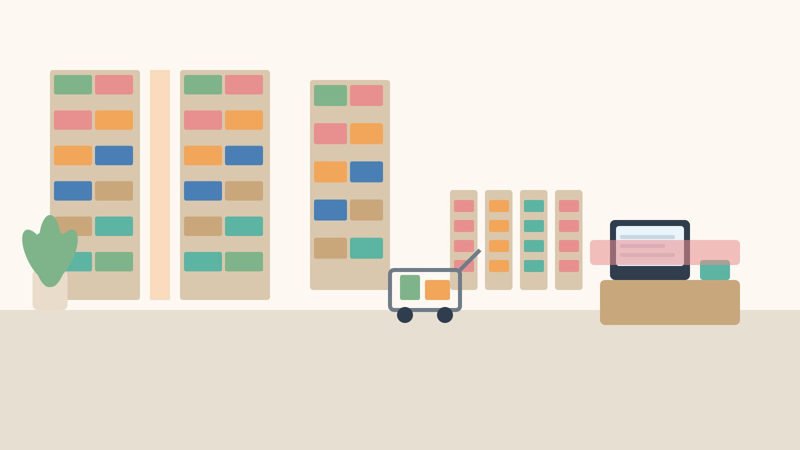
Impulse zones near checkout: small space, outsized basket lift
The last five metres before payment are the most expensive real estate in the store. Customers are already committed; their hands are free while they wait. Classic Indian impulse fits here:
- Chocolates, candies, chewing gum, single-serve snacks
- Batteries, phone cables, pouches of shampoo/conditioner
- Seasonal items (rakhis, diyas, school stationery in June)
- Cold drinks and ice cream if the freezer can sit without blocking the queue
Rules that keep impulse useful instead of chaotic:
- One SKU deep for true impulse. If the customer has to dig, they won’t.
- Price points people can decide in three seconds. Avoid confusing multipacks that need mental maths.
- Rotate weekly. Stale impulse feels like clutter and trains regulars to ignore the rack.
- Never block the scanner or bagging area. A second of friction at the counter costs more goodwill than one extra chocolate sale.
Multi-counter stores should mirror the same impulse strip at every open till. Otherwise the quieter counter looks “empty” and shoppers flock to the busy one. If you run several tills, see how multi-counter billing software keeps queues and counters in sync so layout and staffing move together.
Planogram basics without a corporate planogram team
A planogram is simply a shelf map: which brand, which facing, which height. You do not need a multinational’s software to start. A printed photo of each bay, annotated with SKU names, is enough for a 10–20 staff store.
Eye level is buy level
Place high-margin and high-turn items roughly between waist and eye of your typical adult shopper. Kids’ products can sit lower. Heavy rice and oil bags belong on lower shelves for safety — but keep a few “display” packs of premium oil at eye level so the category still sells up.
Vertical blocking vs brand blocking
Vertical blocking stacks one brand from top to bottom so the eye reads a colour column. Brand blocking groups a manufacturer’s range together. For Indian FMCG (soaps, biscuits, noodles), vertical brand blocks usually win because shoppers recognise colours quickly in a busy aisle.
Adjacency that makes sense
Tea near sugar and biscuits. Shampoo near soap and hair oil. Baby diapers near wipes — not next to floor cleaners. Bad adjacency kills cross-sell even when your offers are strong.
Facing count from sales, not from supplier pressure
Suppliers will always ask for more facings. Your planogram should answer with data: SKUs that sell fewer than X units a week (set X from your own report) lose a facing to the next best seller. That habit alone cleans dead stock faster than an annual “stock clearance” sale.

Measure layout with category sales reports (not gut feel)
After you change a layout, give it two to four weeks before judging — unless something is clearly broken (blocked fire exit, fridge door that cannot open). Then compare:
- Category contribution % — did personal care or snacks rise as a share of sales?
- Units per bill / lines per bill — a cleaner signal of basket size than bill value alone (bill value swings with rice prices).
- Zone or aisle proxies — if your POS cannot tag “aisle 3”, use category groups that live mostly in that aisle.
- Dead SKU count — items with zero sales in 30 days after a facing cut should fall, not rise.
Export category sales from your billing software every Monday morning. Mark the week you changed the power aisle or checkout strip. Owners who run a neighbourhood kirana with the same discipline — even on smaller floors — see the same patterns; the principles scale down to a well-run kirana billing counter as long as you track categories honestly.
Illustrative worksheet (made-up numbers): Before checkout impulse refresh — snacks contribution 9.4%, lines/bill 6.8. After three weeks with a rotated impulse strip — snacks 11.1%, lines/bill 7.3. Staples share dipped slightly as a percentage (expected) while absolute staple sales stayed flat. That is a healthy layout signal: people still buy rice, they just add more non-staples.
A practical weekend layout checklist for Indian stores
- Photograph every aisle before you move anything (phone photos are fine).
- Clear the power aisle of cartons; restore 1.5 trolley widths.
- Place one destination category (rice/oil or dairy) so the path crosses mid-margin shelves.
- Rebuild the checkout impulse strip with weekly rotation and one-SKU-deep facing.
- Print a one-page planogram photo for the two messiest bays (usually biscuits and personal care).
- Brief staff for five minutes: “where is X?” answers should match the new map.
- Note the date in your category sales folder so next month’s report has a before/after.
If you are still on paper notebooks for stock and sales, layout experiments will feel like guesswork. A modern bill-and-stock system with barcode billing, GST invoices, low-stock alerts and multi-counter support makes the measurement step painless. Caddayn Biller covers those confirmed needs for supermarket and multi-branch shops (Windows app and web), including UPI, card and cash settlement — so when you move a shelf, you can see whether the category actually moved. Explore the product pages or download a trial from the downloads section when you are ready to connect floor plan to figures.
Common layout mistakes that shrink the basket
- Entrance blocked by dump bins. The first three metres set the mood. Keep them open and bright.
- Fridge doors that open into the power aisle. Re-hinge or shift the unit; every collision trains shoppers to avoid that zone.
- Mixing return-to-vendor cartons with live stock. Returns belong in a back room, not on the gondola end.
- Hiding high-margin categories in the darkest corner. Lighting is part of layout. A cheap LED strip often pays for itself in personal care.
- Changing everything at once. Move one zone per fortnight so you can attribute results.
FAQ: supermarket layout ideas
1. What is the best supermarket layout for a 1,000–2,000 sq ft store in India?
Most stores in that size band do well with a hybrid: a short racetrack for produce, dairy and bakery near the entrance, then a clean grid for packaged grocery and non-food. Pure racetrack wastes space; pure grid under-sells discovery categories.
2. How often should I change my supermarket layout?
Major skeleton changes (grid vs loop) once a year is enough. Impulse strips and end-caps can rotate weekly or fortnightly. Planogram tweaks for slow SKUs can be monthly, driven by category reports.
3. Do planograms matter for a family-run supermarket?
Yes, even a photo-based planogram stops well-meaning staff from “tidying” shelves into chaos after a delivery. It also gives you a fair answer when a salesperson demands extra facings.
4. How do I know if a new layout increased basket size?
Track lines per bill and category contribution for two to four weeks before and after the change. Prefer lines per bill over bill value when staple prices are volatile. Mark the change date in your sales export.
5. Should checkout impulse include groceries or only snacks?
Keep true impulse for low-decision items (confectionery, single-serve personal care, seasonal small goods). Staple groceries at checkout create clutter and slow the queue. Put grocery promotions on end-caps instead.
Good supermarket layout ideas are not about copying a mall hypermarket. They are about matching your floor shape, your regulars’ missions, and your category margins — then proving the change with the same reports you already use for ordering. Start with the power aisle and the checkout strip this month; let the numbers tell you where to go next.